
Guide for the Optimal Structure of a Digital Product’s Landing Page
I have looked at various blog articles with very good suggestions and here is what I have found to be promising.

Introduction
When I recently had to develop a new landing page for a digital product - a mobile app in the B2C entertainment and sports sector - I intensively researched current best practices and expert opinions on the structure and content of landing pages. I went through blog posts and tweets such as these1. All of them contained very good information, but I always had additions or changes based on my own experience. This gave rise to the idea of developing an ideal target structure based on my research and on my experiences, which I would like to present in this article. But let's first explore some fundamental concepts about landing pages.
As development cycles for digital products become shorter and the market becomes more and more dynamic and innovative, landing pages for a specific product or for product features have become increasingly popular. So what is a landing page, how does it differ from a website and how should it be structured? The latter is all the more important as the landing page is often the first contact point for a potential customer. The better the landing page “works”, i.e. leads to an action by a prospective customer in the sense of a further step on the conversion roadmap to a customer, the more it fulfils its purpose.
Studies2 show that optimally set up landing pages see an average of 30% increase of conversion rate than their counterparts. There are often just simple and avoidable issues that lead to poorer conversion rates and leave behind lost opportunities and frustrated visitors, considering that users often decide after just a few seconds whether they want to look at the page for longer or leave it. Looking at these issues, to name a few:
Too much and poorly structured information: What is the USP of the product and what should be sold?
Unclear value proposition: What are the benefits of the product, what does the customer get out of it?
Lack of trust: There is a lack of evidence of the trustworthiness of the company, the brand or the product (keyword “social proof”)
Unclear or poorly structured user journey
Content not mobile optimised, poor loading times or site performance3
Multiple or dissatisfying calls-to-action
It therefore makes sense to define a template and a kind of roadmap or checklist for the landing page, which helps to avoid the potential issues mentioned above.
This article should therefore provide answers to the following questions on the topic of landing page structure:
What are landing pages and how do they differ from classic websites?
What does an exemplary landing page structure look like?
What effect do the individual elements of the landing page structure have?
What other points need to be considered in addition to the structure of the page?
Landing pages and how they differ from classic websites
A landing page differs fundamentally from a traditional website in several key aspects. In contrast to classic websites, which usually represent a company's interface to the web and are created for use by different stakeholders and groups of interested parties, landing pages only have one goal: conversion with regard to a single action: This can be the subscription to a newsletter, the ordering of a service, a purchase or the download of a product.
In addition to the product focus, landing pages are often also geared towards specific target groups, which is reflected, for example, by specifically addressing the respective target group on the landing page.
The goal of the landing page, the conversion action, is referred to as a “call-to-action”, or CTA for short. The CTA, which represents the goal of the landing page, can usually be reached via a button at various points on the page and always leads to the same action. Ideally, the landing page should only consist of one page, possibly supplemented by a few support pages (e.g. for Terms & Conditions or Data Protection Policies) and, despite its very limited character, offer the full scope of SEO visibility and page analytics in order to closely track success metrics and conversion rates.
Let's summarise the characteristics of landing pages that set them apart from websites:
Single conversion purpose: Pursuing a single purpose in the context of customer conversion
Targeted messaging: Specific addressing of the respective target group
Call-to-action (CTA): A CTA that can be offered in several places and leads to the same action in each case
Single page or simplified navigation: Very few pages with very simple navigation and a large vertical extension, especially on the central page
SEO and analytics optimised: Success metrics tracking, SEO keyword optimisation
Exemplary structure of a landing page for digital products
First, I will present the overall structure of the landing page and then go into more detail about the individual elements. So here is the high-level overview:
In the following sections, I will explain how the individual sections of the page are structured, what they should and may not contain.
Header Section
The header section should have a simple, clear structure and make it possible to directly access individual sections that are of interest for the user, especially the CTA section (Call-To-Action, see below). It starts with the logo in the top left-hand corner for better recognition followed by some menu items and the CTA button. It is important that an alternative menu is displayed for small horizontal window sizes.

Elements of the header section:
Logo of the product or of the company or product linked to the top of the landing page. Don’t forget alt text description for better SEO visibility.
Menu items with symbolic links (starting with #) to different sections of the page or probably to other pages if there are some. As it is a landing page, there should supposedly be no other pages to link to in the top header. Avoid making it more complex and letting the visitor see all content at once only with scrolling. Leave out links to administrative pages like terms & conditions page as these can be linked in the footer section.
CTA (Call-to-action) button that is linked to the CTA-section of the page or alternatively to a dedicated CTA page. All CTA links on the page lead to the same CTA section/page.
Alternative 3-stripe-menu item that is shown in case of smaller screen sizes. In this case, all other menu items (except the logo) are not visible. When clicking on the 3-stripe-menu, an overlay menu opens.
Navigation Section can be sticky but does not need to be.
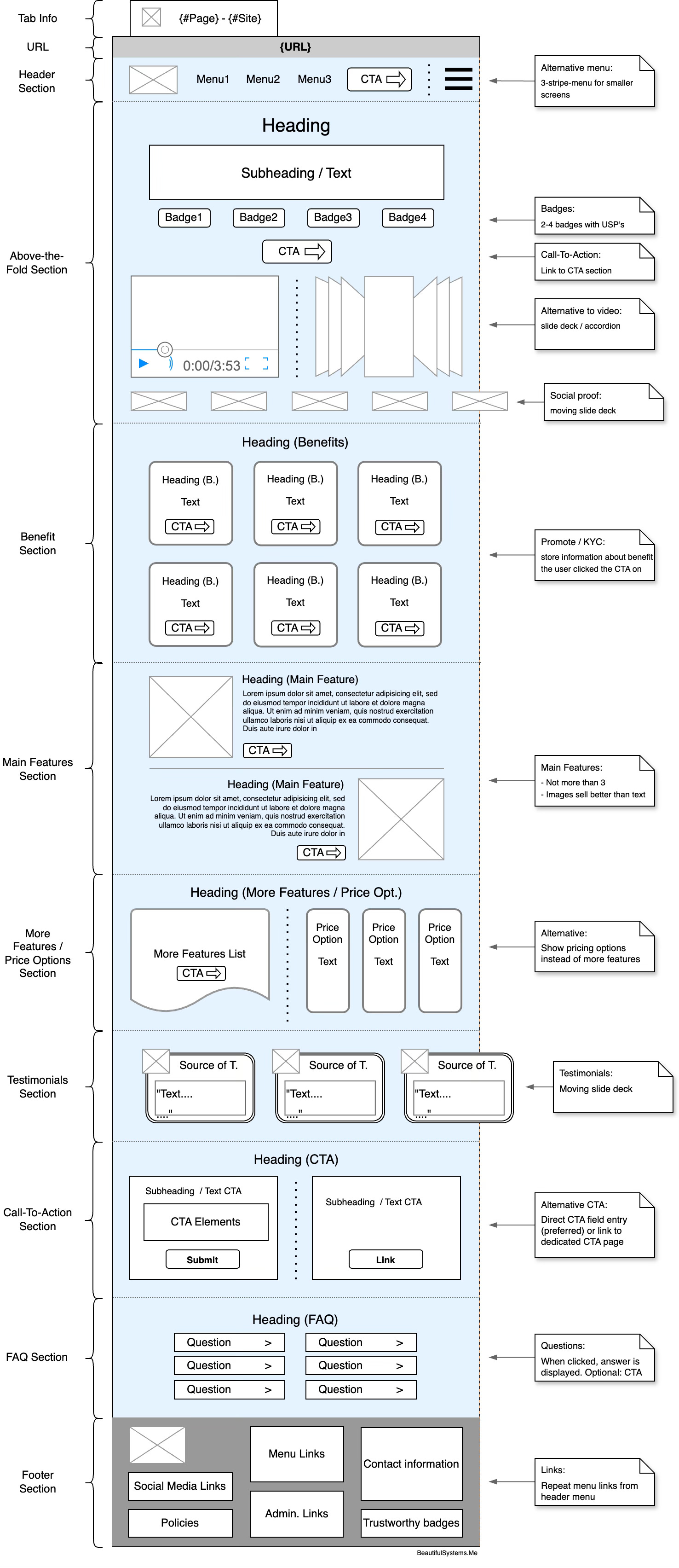
Above-The-Fold Section
The term “Above-The-Fold” comes from the newspaper industry and refers to the part of the front page of the newspaper that is above the fold and therefore catches the eye first. Applied to web design, it refers to the part of the website that is visible without scrolling. A typical desktop screen with approx. 800 pixels vertically is used here.
Two elements - among others - should definitely be included in this area: The main value proposition - which is why this area is often called the “main fold” and a “hero” image or video showing the product - which is why this area is often called the “hero section”.
Elements of the Above-The-Fold section:
Heading with a short and focused Text in big letters stating the purpose or unique selling proposition of the product or the special topic this landing page is made for.
Subheading or normal text with an explanation of the statement in the heading. Kept short to not overload the user with information.
Badges with USP’s or features that separate this product from others
CTA button that directly jumps to the CTA section
Choose one alternative4:
Product Video: A short video that explains the product and shows more details on a high level.
Make sure the user does NOT leave the page when clicking on the video. Probably create a faceless video from a blog article on the product or some other content.Slideshow/accordion: Show some pictures that explain the product but not only show nice things. Clicking on an image should link to the next section of the page. You may use the images/stills that you use in the solution/product section and link to this special section.
Social proof icons with stills of logos of organizations that the organization is partnering with or that already use products of the organization or in some other ways are partnering with the organization. Make sure that you have acknowledgement from every organisation that you show in this list to do so.
If the product is not released yet and the company is not partnering with organisations that can be shown or there is only one or two of these items, better SKIP this section showing social proof icons completely.
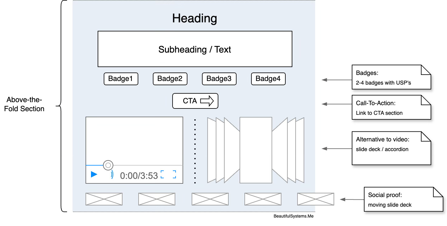
Benefits Section
Highlighting the benefits of a product is crucial for the success of the landing page. Benefits have a real value for the potential customer because they solve one of their problems, improve their lives or touch their hearts emotionally. They should therefore be given a prominent position on the landing page and can lead directly to conversion, so links to the CTA section should not be missing!
An example for a benefit: “Peace of mind knowing your data is always stored in a safe location.”
An example for a related feature: “Automated backup system with secure cloud storage.”
Elements of the benefits section:
Show some (at least three) benefits that really will help the user when using the product.
Each benefit item should state:
Heading that works as a short teaser
Text that explains why the product creates this benefit
CTA button („Learn more“) that links to the CTA page
When linking to the CTA-page convey the name of the benefit on which the user initiated the CTA action
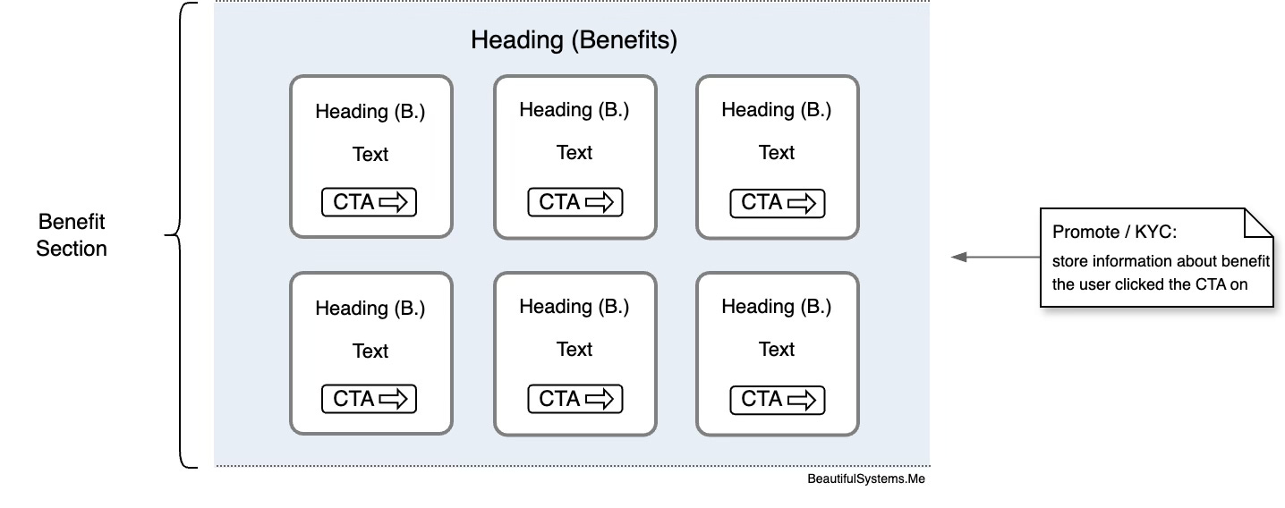
Main Features Section
In this section, which should include a maximum of four features, the outstanding USP features (USP = unique selling proposition) should be presented. As already mentioned above, images – if applicable – should be used for illustration, as visual material greatly supports the conversion process.
Each block consists of:
Compelling Header that describes the feature in short words
Text that explains the feature in more detail
A supporting visual or screenshot of the product
Link to the CTA section
When applicable: Social proof or metrics that shows the practical suitability of the product feature
More Features / Price Options Section
If your product has other important features that should be shown on the landing page, this area is ideal for this. However, each feature should only be outlined in bullet points.
If the page is too long overall, this is the first section that can be omitted.
Alternatively, this block can also be used to display pricing models, provided these are not already part of the CTA.
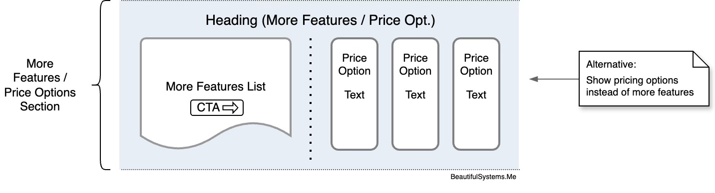
This section contains:
Section with a list of some (4 to 9) main features of the product in short block items or alternatively with pricing options for the product.
At the end of the section there should be a button with link to CTA (“Explore Features” in case of a more-features list or “View Plans” in case of price options.
Testimonials Section
Testimonials are used almost simultaneously with the term “social proof”, although they have a much broader psychological impact, including trust and credibility. Therefore, legitimate testimonials should not be missing.
Testimonials do not necessarily have to come from customers; reviews from experts, feedback from beta testers or from partners can also be presented.
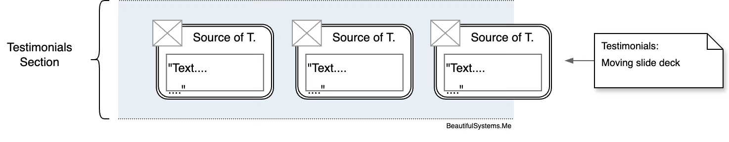
Elements of the Testimonials-Section:
Show at least three to four testimonials – the section can be designed as a slideshow or as a multi-column list, so that multiple testimonials can be listed.
Each testimonial item should consist of:
Full name of the author
Position / organization (if any)
Photo (if applicable)
Text (probably shorten the text to focus on the main parts. Never change the approved text, show that you cut the text, probably get additional approval for the cut text)
Optional: Verification badges
Optional: Logo of the company the author is working for
CTA (Call-To-Action)
This section is probably the most important section of the landing page as it states out the conversion point for the visitor’s interest into the desired action. Reason enough to carry out intensive A/B tests, metrics or QA measures to ensure that optimal results are achieved.

Elements of the CTA-Section:
Header that supports the user in the decision to take the desired action. Intention could be to learn more about the product and be kept updated.
Examples for headers: “Get Beta User Access”, “Join the Waitlist”, “Start using [product name] today”
Short text that explains what will happen next after taking the action.
Example approaches could be: “Get instant access to our 30-page market study”, “Be the first to know when the product is available” or “Receive our bi-weekly newsletter in your inbox on Mondays”
Provide a link to an overlay modal frame with terms and conditions that apply when subscribing to the newsletter that opens when clicking the link and closes when clicking outside the frame or on the „X“-button instead of linking the user to a separate page with terms & conditions (even if it may exist).
Action button that matches the indicated action. Use captions like “Download now”, “Stay Updated” or “Join our community now”
Footer Section
The footer section rounds off the landing page in such a way that, in addition to elements for legal compliance and navigation, elements for further trust-creating elements and for SEO optimization can be placed here.
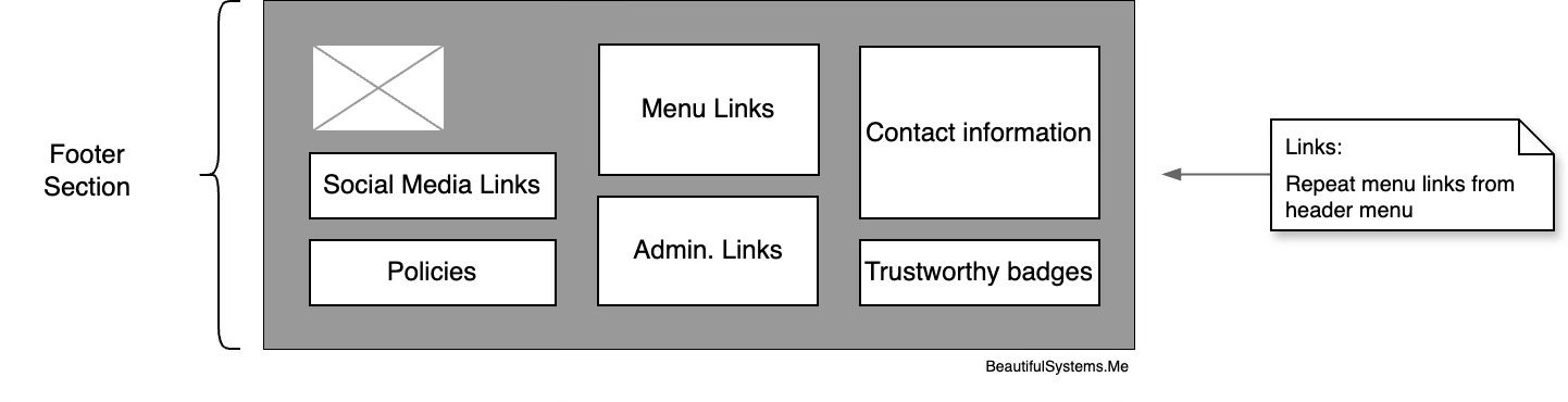
Elements of the Footer Section:
Link to legal information:
Terms & Conditions page (or to the overlay as you choose),
Privacy and Cookie Policy,
Imprint
Repetition of links from the header menu section
Links to possible social media accounts (if any)
Information for the user:
How to get in contact
Who is responsible for the page
Optional: Logos of trustworthy-providing organisations or public groups that approved some kind of trust in your organisation (e.g. trusted shops) or other outstanding social proof that you may show in the footer.
Avoid additional CTA-elements in this section like an entry field for newsletter subscription.
Overlays
Overlays are a practical way to draw the user's attention to something or to respond to a user action that would actually lead to a new page call.
CTA Overlay
Shown after the user started scrolling the page and 15-20 seconds are gone.
Other trigger timing variations are also possible like:
Action based: The user is about to leave the page
Scroll-based: The user has scrolled a distinct amount
Time-based: A distinct amount of time has passed
„Modal“-overlay with modified CTA section with a „X“-button to close the overlay in the upper right corner located in the center of the view pane.
There could be a special action only shown in this overlay, i.e. “Only Today: Get 10% off all subscriptions”
Probably offer the user some occasional bonus to make the overlay screen seem time limited and special
Once the user has closed the overlay with the “X”-button it should NOT be shown again during the user session (for example, set session cookie to store this information).
Terms-And-Conditions / Privacy Policy Overlay
Overlay that is shown when the user clicks on the “with clicking here you accept our terms and conditions”-link or the “privacy policy”-link in the CTA section before he/she submits the data.
This overlay is to avoid possible post back / page load activities that could be a possible cause for users not completing the desired page action.
The modal window should contain a short heading and a text that contains the content of the desired policy including the way, the data entered by the user is processed, stored and used. Also describe how the user could unsubscribe or initiate removal of the personal data.
Conclusion
Creating an effective landing page is crucial in the digital products sector and companies can less and less afford to lose prospective customers on the way to conversion. Therefore, the outlined structure provides a framework that addresses the core challenges in terms of digital product marketing.
When implementing this framework, one should keep the following things in mind:
The key is to strike a balance between meeting the needs of the prospect, providing enough information and pursuing a clear goal of conversion. Sometimes, less is more.
There is no one-size-fits-all solution that always works. Therefore, the page should be designed for regular changes and an easy exchange of elements and content. The use of analysis data - preferably from the very first week - ensures the success of changes and provides information about gaps in the implementation.
I would be very happy to receive feedback on this article, especially on the results of implementing the template.
In an upcoming article, I will discuss the technical challenges of implementing the framework on a common platform (Astro, Tailwind and Google Firebase). As a follower, you will be notified as soon as this article is published.
Thank you for reading.
https://x.com/oliverkenyon/status/1836315728426725829
https://x.com/vickAlmondo/status/1834505819800408484
https://x.com/namyakhann/status/1823681367198085428
https://x.com/HamzaAhrbil/status/1820183991548571701
https://medium.com/@urlaunched/how-to-make-a-lead-generation-landing-page-for-startup-3cb5147b0462
https://medium.com/datadriveninvestor/7-key-elements-of-a-high-converting-landing-page-for-your-newsletter-7eadd47e9fb2